
|
Contributors
Latest Posts Show All Recent Posts Archive
Tags Everything |

|
Contributors
Latest Posts Show All Recent Posts Archive
Tags Everything |
To contact a Direction representative, please click the button below:

Welcome to another Printing 101 blog entry - Weighing in on Paper
If we are going to talk print, let’s start with a vital basic – PAPER.
You’ll find the widest variety of papers available when you are running an offset print project, as the presses have flexibility to handle different thicknesses and coatings. The presses currently used in digital printing have a more limited tolerance for paper options.
There are four criteria used to grade paper - weight (thickness), texture, brightness, opacity and the combinations can become overwhelming. If making a paper selection seems like a daunting task, the easiest solution is to request a suitable “house stock” be used for your project.
The most essential paper specs to note are the paper weight and whether or not the paper has a coating.
Text Weight – used in applications like the interior pages of a book. Typically measured in pounds (lb. or #)
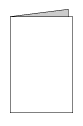
Cover Weight –used in applications like booklet covers, greeting cards. Typically measured in points (pt.)
A list of paper stock recommendations for some commonly run print projects:
FLYER
80lb text to 100lb text
BROCHURE
100 lb text
POSTCARD
12pt or 14pt cover

BUSINESS CARD
14pt or 16pt cover
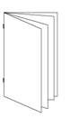
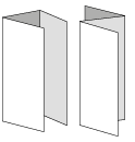
MULTI-PAGE BOOKLETS
80lb text for booklet cover & interior pages
OR
12pt cover weight for booklet cover & 80lb text for interior pages
PAPER COATINGS:
Any paper weight can have a coating applied during the manufacturing process and it will affect the way that inks are absorbed in printing and therefore how colour comes out. These are coatings that are right on the stock, (not to be confused with the coatings that can be applied on press during the printing process – but that’s another blog topic!)
So which coating to choose is largely a creative decision ;) The three most popular coatings are gloss, matte or uncoated.
Gloss – adds a reflective shine and makes colours pop.
Matte – adds a subtle silky sheen.
Uncoated – no coating is applied. Inks soak in to the paper and give images a softer look.
For the more adventurous print buyer - have a consultation with your Direction Printing Account Rep to discuss the array of paper options and to get samples (always happy to review & share samples!)
|
|
|
|
|
|

It’s officially now spring – as a print provider I have golf and colour on my mind. You can play each hole employing several strokes to get the ball in the cup – or you can figure out how to play in the zone and drop the ball in one stroke. Problem solving on a new client’s project has reminded me of the benefits for adding a Pantone colour to offset print projects and effectively scoring a “hole in one”.
A little background on Colour Systems
Process
Offset printing creates the illusion of “full colour” using four process inks - CMYK (Cyan – Magenta – Yellow – Black). Varying amounts of these four primary inks generates the array of colours.
Pantone (PMS)
Pantone Matching System (PMS) is a proprietary colour space used in a variety of industries, primarily printing. By standardizing their colours, different manufacturers in different locations can all refer to the Pantone system to make sure colors are consistent. In offset printing, PMS inks offer a tonal range that CMYK inks do not - including specialty inks such as metallics and fluorescents.
In the case of our NEW client – they came to us with print samples showing their company logo and their corporate orange was not consistent from project to project or even from page to page within their catalogue. Their corporate/brand identity was something that they considered colour critical and up to the point of meeting us - it hadn’t been resolved.
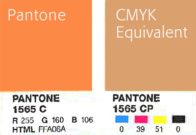
As a first step, we tested colour swatches in a variety of CMYK combinations and none were quite right. Then we recommended selecting a PMS colour for their logo as it would produce reliable and vibrant results. Our client opted to go this route PMS #1565 and they’re relieved and happy with the predictable results this produces. We scored an ace with our NEW client by solving their colour dilemma.
For comparison, here is a scan of the Pantone swatch shown next to the CMYK equivalent:
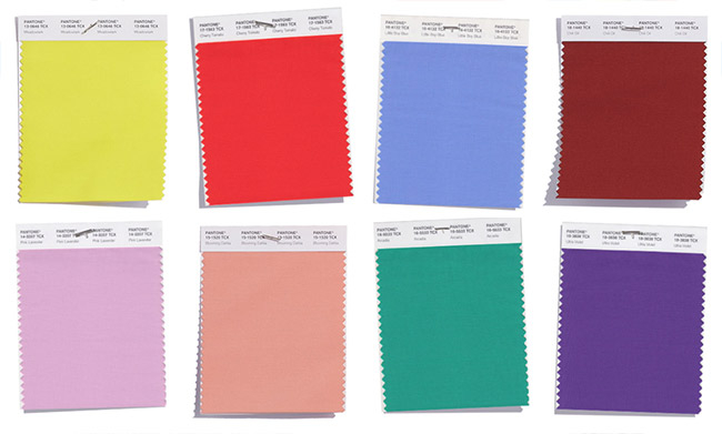
What’s your favourite colour from the Pantone Spring 2018 collection?
https://www.pantone.com/fashion-color-trend-report-new-york-spring-2018
|
|
|
|
|
|

We strive to provide our clients with the best overall experience on their projects. From point of order to delivery, we want to make sure that we’re getting “two thumbs up” from you! Don’t just take our word for it, here is some of the feedback we’ve received this week:

“I just wanted to reach out and thank you for all your help with the job. We received the catalogues last week and they look great, it’s kept our shippers busy in sending off to our distributors! The quality of you and your team’s service throughout the process was exceptional. We are very happy!”
Josh, Marketing & Logistics Manager – Hygienic Supplies Manufacturer
“When the planners came in, people were so excited about them there was buzz through the office. It was a huge project, and—as always—on a short timeline. The print quality is beautiful, the colours are rich, and the result is a hearty, practical product that people are excited to use.
Despite our projects often being of an “ASAP,” “quick turnaround,” “strange request” nature, anything we throw at you is taken in stride. From the quoting process, all the way to your lunchtime hand-deliveries, I always feel like our work is handled with a special attention.”
Kaytlyn, Graphic Designer – Magazine Publication
“I can tell you our experience with your team has been quite positive, really appreciate your fantastic service.”
Adam, General Manager – Family Recreation Facility
“Just received the Schedules and I thought I’d let you know that they look GREAT! Thank you so much for all your help and hard work with this project and for always doing a great job with our printed materials. :)”
Soni, Senior Graphic Designer – Non-profit Community Organization
“Hey guys – just wanted to say the booklets look fantastic, thanks so much!”
Connor, Graphic Designer – Museum and Exhibit Space
|
|
|
|
|
|